Data doesn’t tell stories. People do.
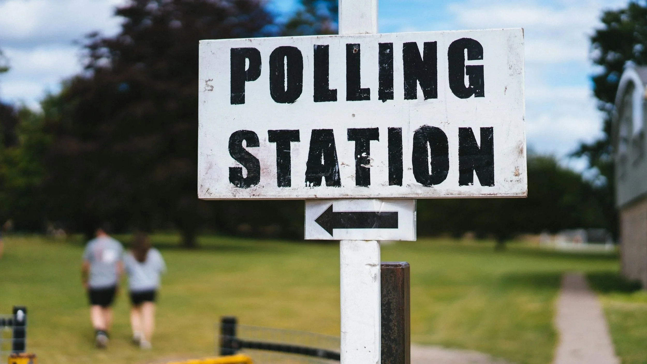
On Thursday last week, millions voted in local and regional elections.
The results came in on Friday, and throughout the weekend, every pundit under the sun has been crafting their stories about the same set of numbers. What the heck just happened!?
The funny thing to me is a lot of these stories are completely conflicting.
Some of this is obviously political spin. But a lot of these stories are from independent political pundits and elections analysts, drawing different conclusions from the same information.
They all have access to the same objective data in the form of votes. So what’s happening? What’s missing?
I want to take a look at some of these narratives, and see if there are parallels between this and how we measure impact in Widening Participation in Higher Education.
What ‘winning’ looks like
Reform gained over 1,400 seats, and took control of 14 councils. Nigel Farage declared this as a ‘truly historic shift’ and many headlines suggest Reform are the next government in waiting.
But that is just looking at a number in isolation.
Peter Kellner in his Substack suggests that Farage should be worried. He points out that Reform’s seat win percentage is actually down from last year, from 41% to around 33% this year. So have Reform peaked?
The BBC methodology also presents all of Reform’s results from basically a zero baseline because they didn’t exist a few years ago. What looks like an absolute tidal wave of votes from nowhere, is in part, a function of how the data is presented.
In Widening Participation, we see this happen too. A programme reports record engagement with 200 students! Hurrah!
…what the headline doesn’t mention is that they were comparing it to 2020-2022, when everything was delivered online. Or that ‘engagement’ means ‘liked the Instagram post’. Or that they weren’t measuring it in previous years, so there is no baseline. It might well be a massive success. But it also might not be.
Data always sits within a context, and the context you use can change the story you tell.
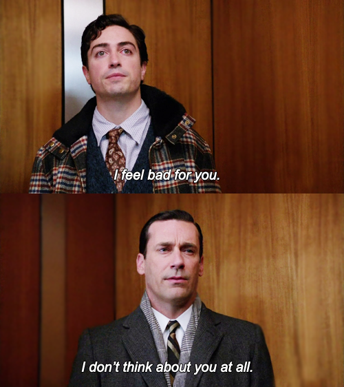
Kemi Badenoch (top) and everyone else (bottom)
Surviving disasters
The Conservatives lost over 500 councillors, and lost control of 6 councils. They even lost Essex, were Kemi Badenoch herself has her constituency. But Badenoch told the media that the Conservatives had ‘done brilliantly’, gaining Westminster, and that they were on the up.
This would be like your football team getting hammered 5-1, but in the post-match presser, the manager excitedly banging on about the 84th minute consolation goal being a screamer.
The brutal truth is, I think that at this point, no one is really paying attention to the Conservative party anyway.
In Widening Participation, you sometimes see this cherry-picking happening too. A programme has ‘mixed results’, but one particular school showed promise.
There is a difference between an impact report that uses a case study, and an impact report that focuses its analysis on an individual result, ignoring the wider picture. This is a choice, made after the results came in.
Broad brushes
While Reform gained over 1,400 seats, Labour lost about as many. Many in the media are reinforcing the narrative that Labour’s failure to address the issues that Reform prioritise (like immigration, and also, immigration, and… you know… immigration), has meant that Labour voters are ditching them for Nigel.
If we look at the data in more detail though, and start to ask why they lost and where, you start to find a different story.
In many areas, Labour didn’t lose votes to parties on the right, it lost ground to the Greens. That Westminster seat that Kemi was celebrating, was exactly due to this, as pointed out by Sir John Curtice in his analysis of FPTP voting in this election.
Often it was those switches to the Greens that allowed Reform to win on the split vote. Labour keep chasing Reform on policy, but you can argue that Labour voters are deciding that the Greens are now more representative of their views. So Labour lose their base, but are failing to convince any Reform voter to back them instead.
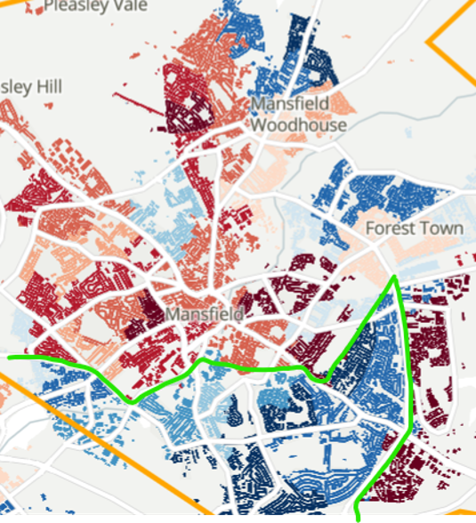
Mansfield by Indices of Deprivation (IMD). Red is most deprived, Blue is least deprived. You can draw a big green line between the two!
Just looking at broad results suggest one thing, but breaking things down to a more granular level suggests another.
In Widening Participation, we see this too. For example, you might see an overall progression rate for a cohort increasing from 68% to 75%, and thinking that it looks great.
But then you break down the results, by ethnicity, or by socioeconomic status, and the picture changes. You find that the overall number was hiding that there were equality gaps increasing, not decreasing within the group.
I recently presented an analysis of the demographics of Mansfield to staff at NTU. If you look at Mansfield town overall, the levels of socioeconomic disadvantage aren’t great, but it isn’t terrible.
So why would the University focus so much WP activity on this town over others?
If you break down this data into postcodes, you see that actually the south of the town masks the bigger issue for the rest of the town as a whole (see image left).
You start to have a better understanding of what is actually happening. The broad brush has hidden a much more complicated story.
If you report an overall figure without looking at the variable, you’re not reporting impact. You’re reporting averages.
The reason behind the vote
One of the biggest debates about these results, is why people are voting a certain way.
These results have been framed as the popularity of Reform and Nigel Farage and his politics. And they are also framed as the electorate giving the traditional two-party system a kicking. And they are framed as a representation of the deep dislike of Starmer that the general public reportedly have for him. And they are showing that the Greens are replacing Labour as the left alternative. And they are framed as ‘a natural thing that happens to governments, like it did to Blair in 1999’.
The truth is, just from looking at these results, we don’t know. It could be any and all of these things. Or something else. These questions just can’t be answered from the election results alone.
In Widening Participation, this is what we can see in post-event surveying. You ask a bunch of kids at the end of a summer school how they feel about university. “89% say they feel strongly positive”.
Well of course they do. They’ve just spent days on a sleepover with their mates eating sweets and having fun (and going to some fake lectures). It’s supposed to be positive. But you don’t know whether it was just the experience, or whether it was really impactful.
The things we really want to know are:
Why do they feel like that?
Is this sustained change or temporary?
What will this lead to a change in future decisions?
In the same way, we don’t fully know yet whether this is (a chunk of) the public saying “I genuinely don’t want Labour or Starmer running this country again” or “I don’t like how the last 22 months have gone, you need to change what you’re doing.”

What does this all mean?
None of the election results tell us why this has happened.
The vote numbers describe ‘what’. The ‘why’ lives somewhere else.
The ‘why’ lives in the conversations on doorsteps, or in different community settings. Not what is presented to you on the tv, or newspapers, or radio, but in asking people their views.
It’s the qualitative evidence that always gets overlooked.
In Widening Participation, it often gets seen as secondary to the numbers and figures. The nice bit of texture before you get to the ‘real’ data. But it is real data.
Just seeing declining student numbers doesn’t tell you the story. The interviews and conversations will tell you about the kid who would love to go but can’t afford to move, or were convinced by a parent to stay at home, or that ideal career paths look different for kids these days compared to when I went to uni a decade and a half ago, or for 100 other reasons.
Data doesn’t tell stories, people do.
Numbers are really useful at telling you what happened. But you need qualitative data too, to get to the real story.