6 mistakes people make when designing survey scales
You've filled in enough surveys in your life. You know roughly how they work. So you open a blank form, type a question, add some options, and move on.
It seems easy enough, but I’ve seen some absolute whoppers in my time.
Small errors that completely ruin your survey.
Survey questions, particularly scale questions, look really simple. But they're really not. A badly designed scale question doesn't just give you unhelpful data, it gives you confidently wrong data. Numbers that look meaningful but aren't.
Let me show you a bad example, based on mistakes I’ve seen in real life, and what to do to fix it.
You’ve created a scale question for your survey…
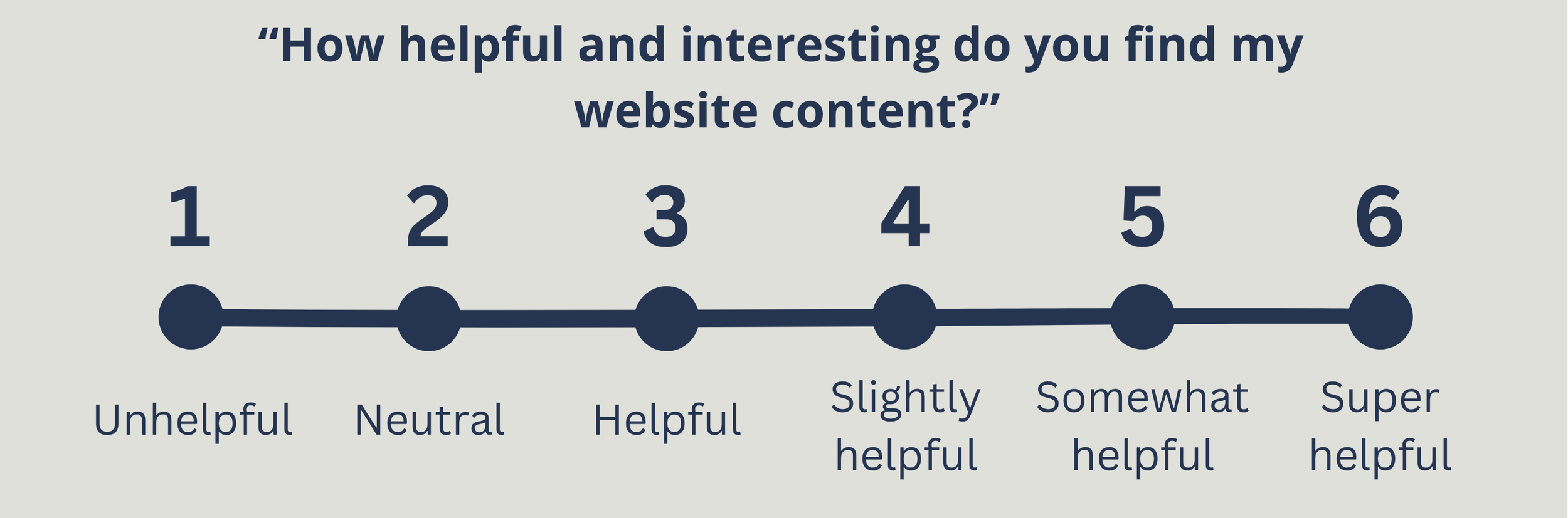
Here's a question I want you to look at:
You’ve probably spotted a few things wrong with this already. But I’ve seen these mistakes in surveys all the time.
There are actually six separate problems with this question. Let's go through them one by one, because each one teaches you something useful.
Problem 1: It's asking two things at once.
"Helpful and interesting" which one are you asking about here?
Something can be interesting but not helpful. An example is when you spend half an hour doomscrolling on Instagram instead of going to bed. Interesting content, but if anything, actively unhelpful.
Something can also be helpful but not particularly interesting. Like an ikea manual for Småstad bed. It was very helpful for me to build a loft bed, but isn’t something I’m going to re-read.
If a participant rates this a 3, you have no idea what they're telling you. Always ask one thing at a time.
Problem 2: "Website content" is too vague.
I’m asking about my “content”. But I’m trying to do lots of different stuff. There is an audio clip here about interview techniques, and there is also a blog post which is (in part) my love letter to my first car.
Which post am I asking about? The whole site? The resources bit?
The question is so broad that two people could answer it and mean completely different things. The more specific your question, the more useful the answer.
Problem 3: The scale isn't balanced.
Look at the options again. At the bottom: unhelpful. At the top: super helpful. These are not equal and opposite.
In fact, the scale only really travels in one direction, from neutral to positive, with one slightly negative option bolted on at the bottom. A balanced scale should have equal weight on both sides of the midpoint.
Problem 4: The neutral point is in the wrong place.
Option 2 is labelled ‘neutral’ but it's the second item on a six-point scale.
That's not neutral, that's near the bottom.
Neutral belongs in the middle. When it's not, participants get confused, and some will pick it thinking they're choosing the midpoint when they're actually choosing something that as slightly negative.
A misplaced neutral here is corrupting my data. Find true neutral, and have it in the middle of your scale.
Problem 5: Six options… an even number.
As mentioned in the last point, this scale is unbalanced and ‘neutral’ is point 2. But imagine we fixed that problem, removed it, and made it balanced, with 3 negative and 3 positive options. We then have a new problem: Even-numbered scales force people to pick a side.
There's no middle ground, no "honestly, I really don’t care about your content Pete, this means nothing to me" option.
For some questions that's a deliberate choice (and there are specific use cases for this). But for most evaluation contexts, especially when you're asking for real life opinions, removing the neutral option means people are forced to create an opinion when they may not have one.
Use an odd number.
Problem 6: Three of the options mean almost the same thing.
Helpful. Slightly helpful. Somewhat helpful. These are not meaningfully different to most people. There may be a difference here but I couldn’t tell you whether one is better than the other.
When participants can't distinguish between options, they just pick one at random, and your data becomes noise.
You might think this is a funny example, but this is actually based on something I saw recently. These things really do crop up!
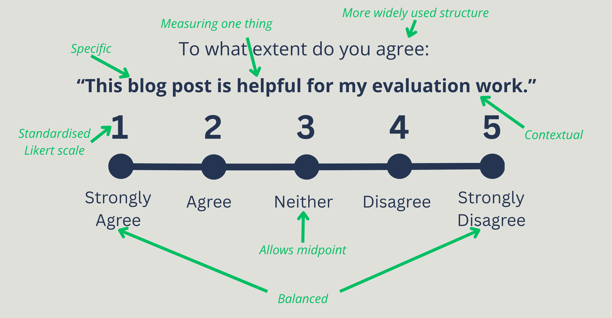
What ‘better’ looks like
I’ve had another think about what I’m trying to evaluate. I want to be more specific, but still have a simple question for you to answer. So here is better attempt.
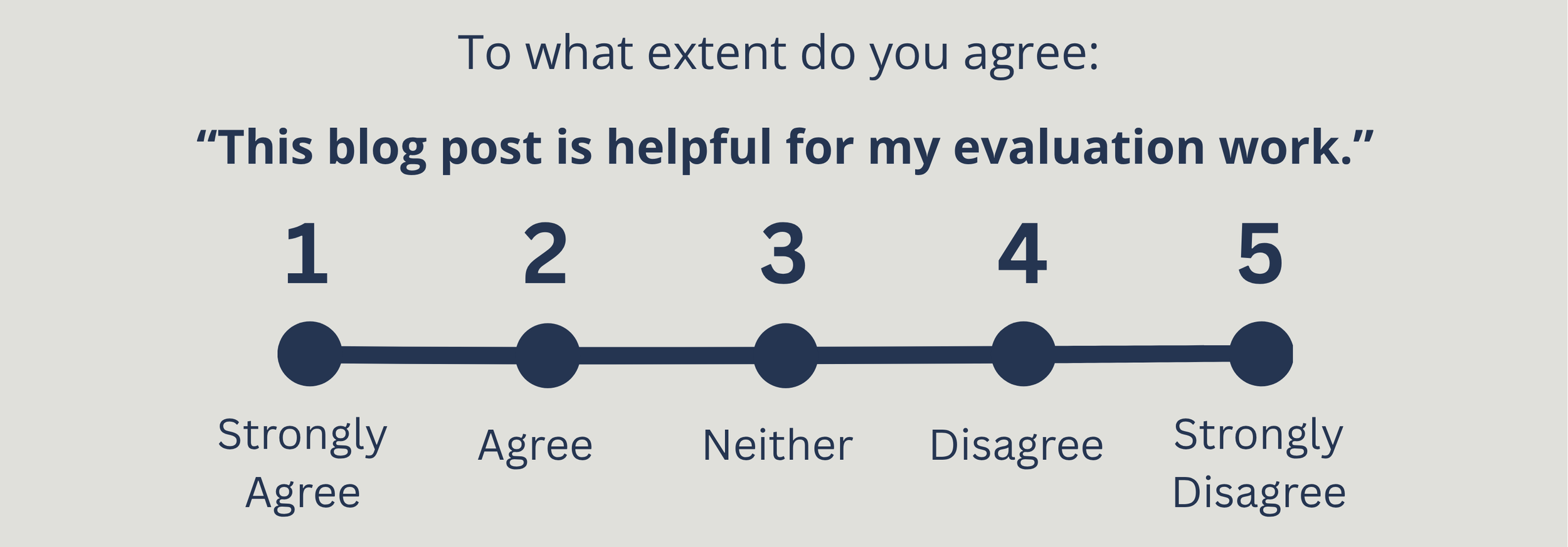
Five options, one clear statement. Balanced on both sides. Neutral in the middle. Each option clearly different from the next.
I want to point out just a few things that have changed.
The question now asks about one specific thing. I want to know about this blog post, and whether it's helpful for evaluation work. Not two things or "content" in the abstract. If I want to know about two things, ask two questions.
It uses a statement to agree or disagree with, rather than asking about helpfulness. I often think this is the easiest and most simple ‘go-to’ structure for a scale question.
Imagine you have a few scale questions in a row. It’s easier for people to tell you whether they agree with different ideas and concepts, than have to place themselves on different scales. The same scale that looks at multiple things.
The neutral option sits at position 3. Now you can genuinely tell me that you don’t have any feelings either way about my blog post. Although if you’ve got this far, I’m hoping you’re at least a 4…
A few more things to think about…
These are simple tips, but it can transform your survey into something useful. And thinking more widely about survey design, there are a few extra things to think about…
1. If a validated scale already exists, use that
A validated scale is basically a scale that has had loads of ‘quality control’ done first. It will be better than what you can make up on the spot.
So, before you write your own scale question, check whether someone else has already done the hard work.
In the Higher Education Widening Participation space, outcomes like wellbeing, confidence, sense of belonging, metacognition… these can all be measured through survey scales, and validated scales to measure them already exist.
Using one means your results are comparable to other studies or evaluations, and you don't have to design your questions from scratch.
A quick search for your outcome plus "validated scale" or "psychometric measure" is a good starting point.
2. Think about your audience.
A five-point scale works well for most adult audiences.
But if you're surveying children, people with additional needs, or participants for whom English is a second language, even this format might create barriers.
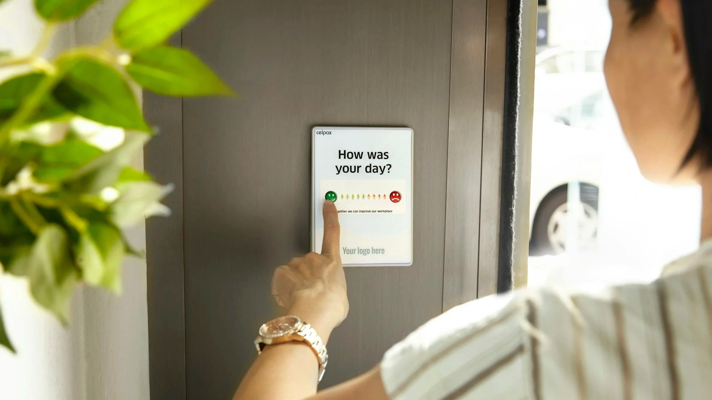
Maybe you use a visual scale. Instead of a scale, use smiley faces, or even emojis, or stickers. The best question is the one your participants understand fully.
3. Think about what you're going to do with the answer.
This is the one people forget most often.
Before you finalise any question, ask yourself: if I get this data back, what will I then do with it? I often ask colleagues “if 73% of your participants agree… what do you do next?”
If the honest answer is "I'm not sure" the question as is might not be right yet. Good survey design starts at the end, not the beginning. Know your purpose first.
A quick checklist before you publish your survey
Next time you write a scale question, ask yourself the following:
Does it only ask about one thing?
Is it specific enough that two different people would interpret it the same way?
Does it use an odd number of options?
Is the scale balanced / equal weight on both sides?
Are all the options different and equally spaced?
Is the neutral option genuinely in the middle?
Have you checked whether a validated scale already exists?
Is the format appropriate for your audience?
Do you know what you'll do with the results?
If you can tick all of those, you're in good shape.
Survey design doesn't need to be complicated. But as I say, simple doesn’t mean it is quick and without thought.
The difference between a question that gives you useful insight and one that gives you confident noise is often down to a few small choices in the design. Now you know what to look for.